Travel Agent Academy (TAA) is part of the travAlliancemediaTM Network under Northstar Travel Group. This brand offers e-learning courses to travel agents and advisors about the destinations, hotels/resorts, airlines, cruises, and services, in order for them to sell more luxury and business travel.
My role at TAA is to design professional e-learning courses for travel agents so they can learn topics about the subject that are effective and easy to remember. I design marketing materials such as web banners and full-page print ads to promote these courses with the creative team. The work demonstrates my adaptability, functionality, accessibility, and fun in designing the course using branding guidelines, colors, images, and typography of each brand to create these courses.
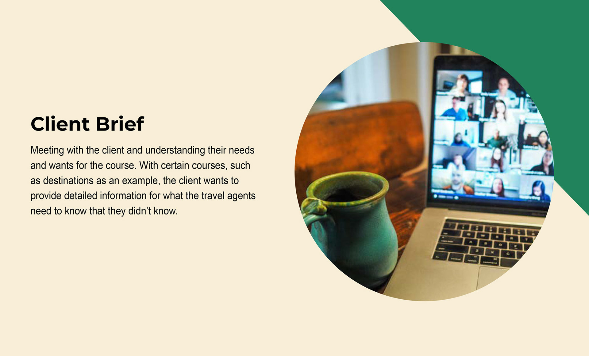
Behind the Process
I designed the chapter mockup by applying the branding guidelines of a client's organization/company, while the writer creates the outline and copy. Once these items are approved after a few revisions, we move into chapter production. During this phase, copy is integrated into the design using content strategy, UI/UX practices, and presentation design principles, all while strictly adhering to brand standards.
Once the course gets finalized after rounds of revisions, the course is launched live so agents can enjoy and learn what they can learn from the course on Travel Agent Academy. Let's go through the process of how a course is made.
_______________
_______________
Course Mockup
Each course has its own branding guidelines. I adapted my designed courses that are for luxury, destination, and vacationing in particular. There are challenges where some branding guidelines are similar across clients (such as hotel brands) or where courses do not have brand guidelines.
Such situations are addressed with solutions, the most common of which is to go to their websites to search for references to create the program, so that design elements from the website can be incorporated into the course.
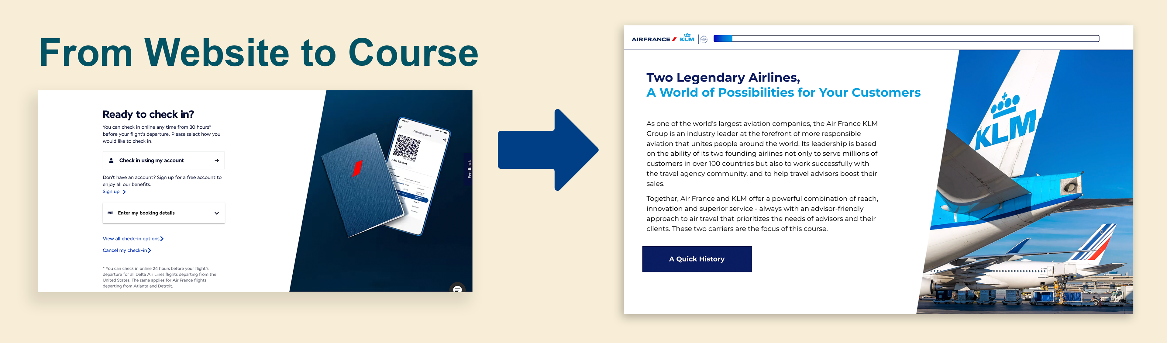
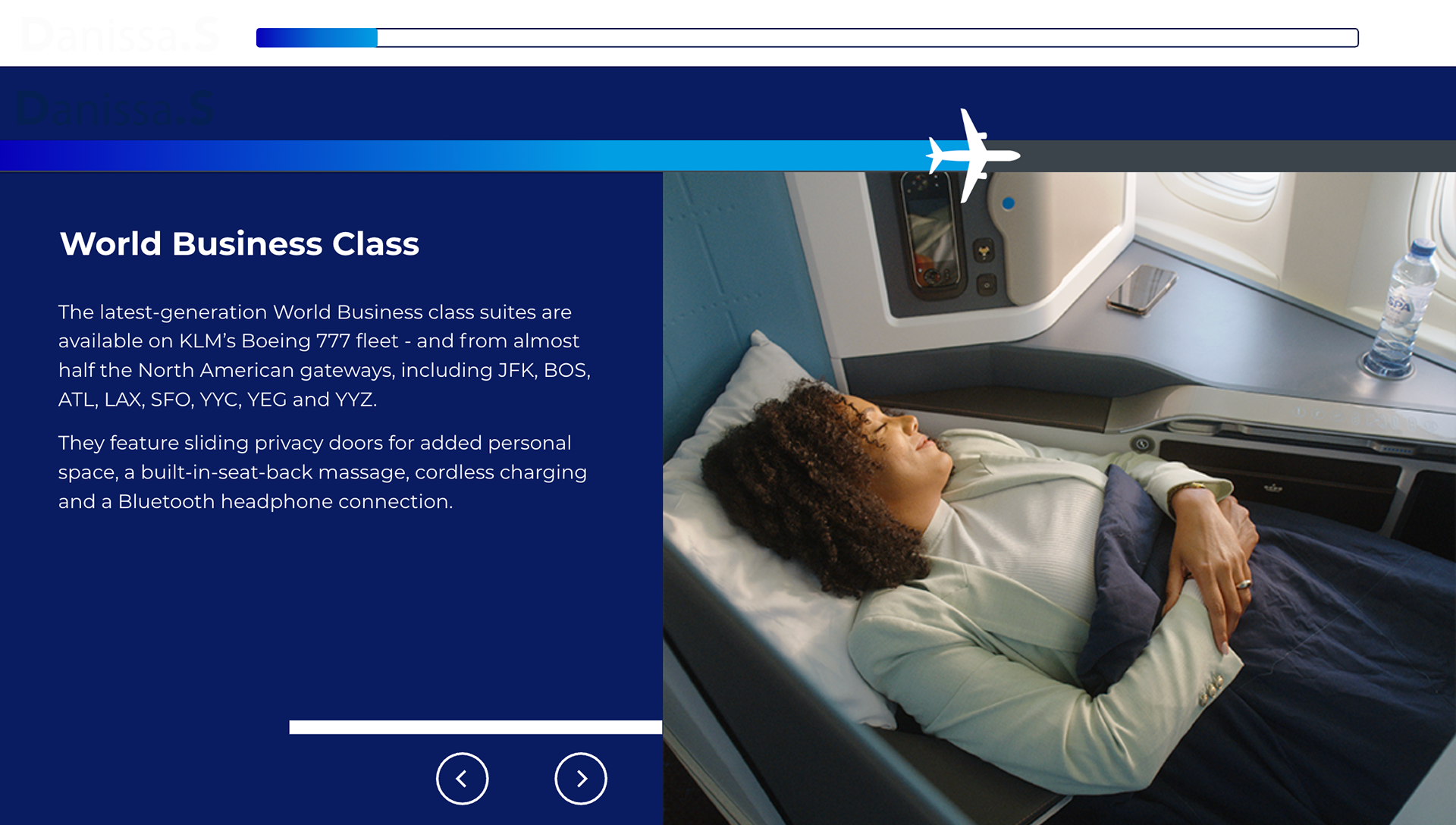
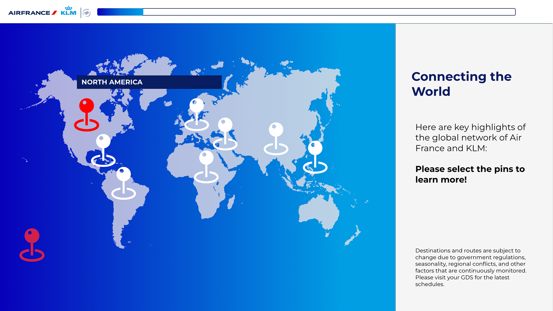
One main example is Air France and KLM, where the challenge is that the course features two airlines; however, their branding guidelines are straightforward. To make it engaging, I use their websites as a reference to incorporate elements. What stands out is their use of the blue gradient, which I apply to the background or to progress bars when the agents continue the course. Here are two main examples of this.
Branding Incorporation
By using the client’s website as a reference. I recreate graphic elements from the site into the course. For Air France and KLM courses, I am using the trapezoid image frame from the Air France site and inserting it into the single-side layouts to match the feel and look of the brand to course.
Bits & Parts
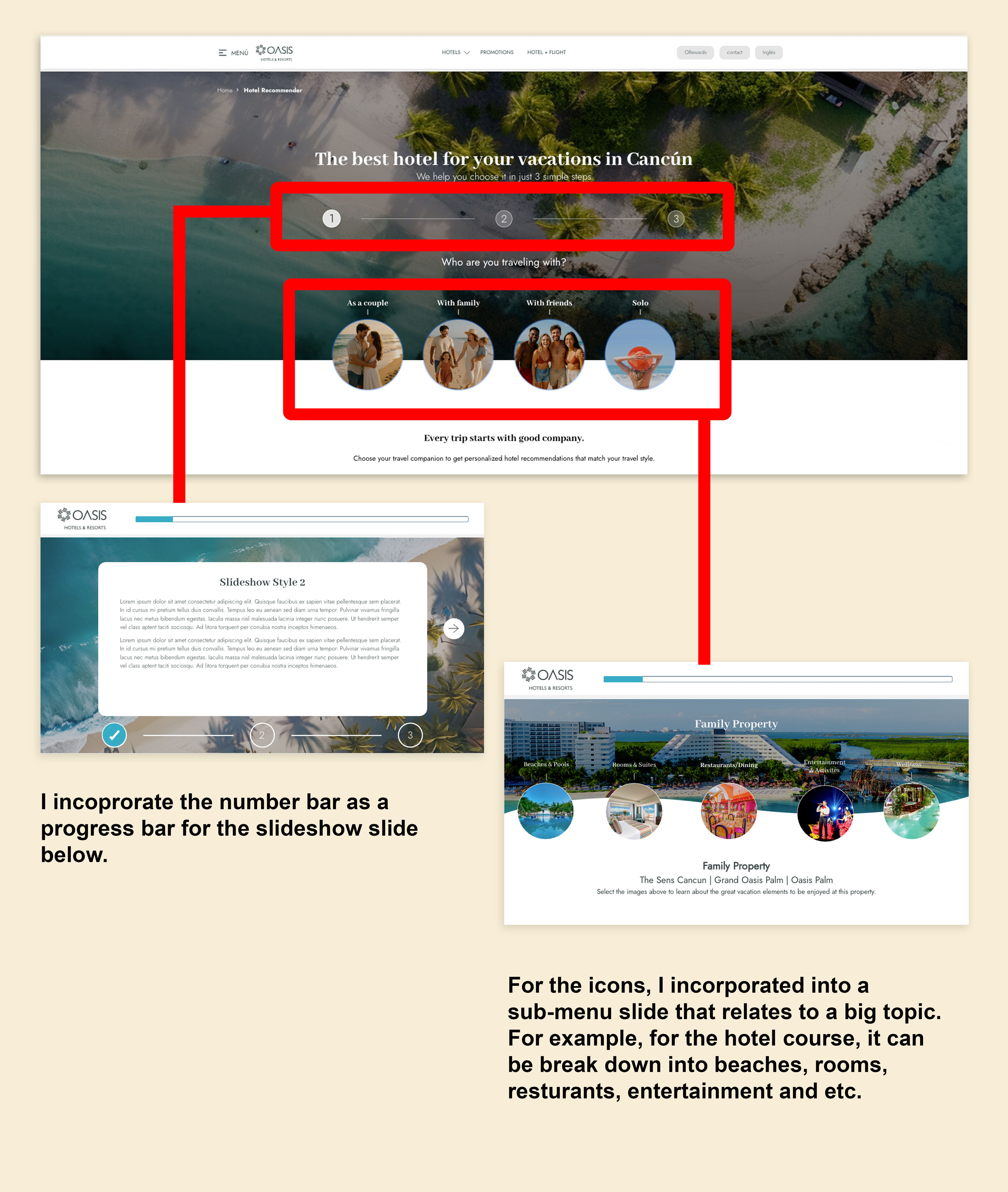
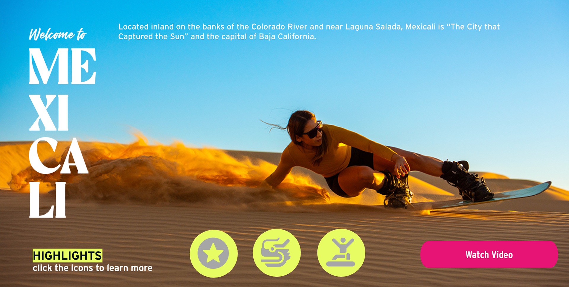
Another strategy of incorporating elements from a website into the course is to take bits and parts of a website page and put them into two different slide layouts that can break down a huge amount of copy for different things, and to maintain the look and feel, where the course matches the brand. For the Oasis Hotels and Resorts course, I take bits and parts of their website page, that is Hotel Recommender, into the two different slide layouts, which are the slideshow and submenu layout. More info about these layouts will be explained below.
Course Production
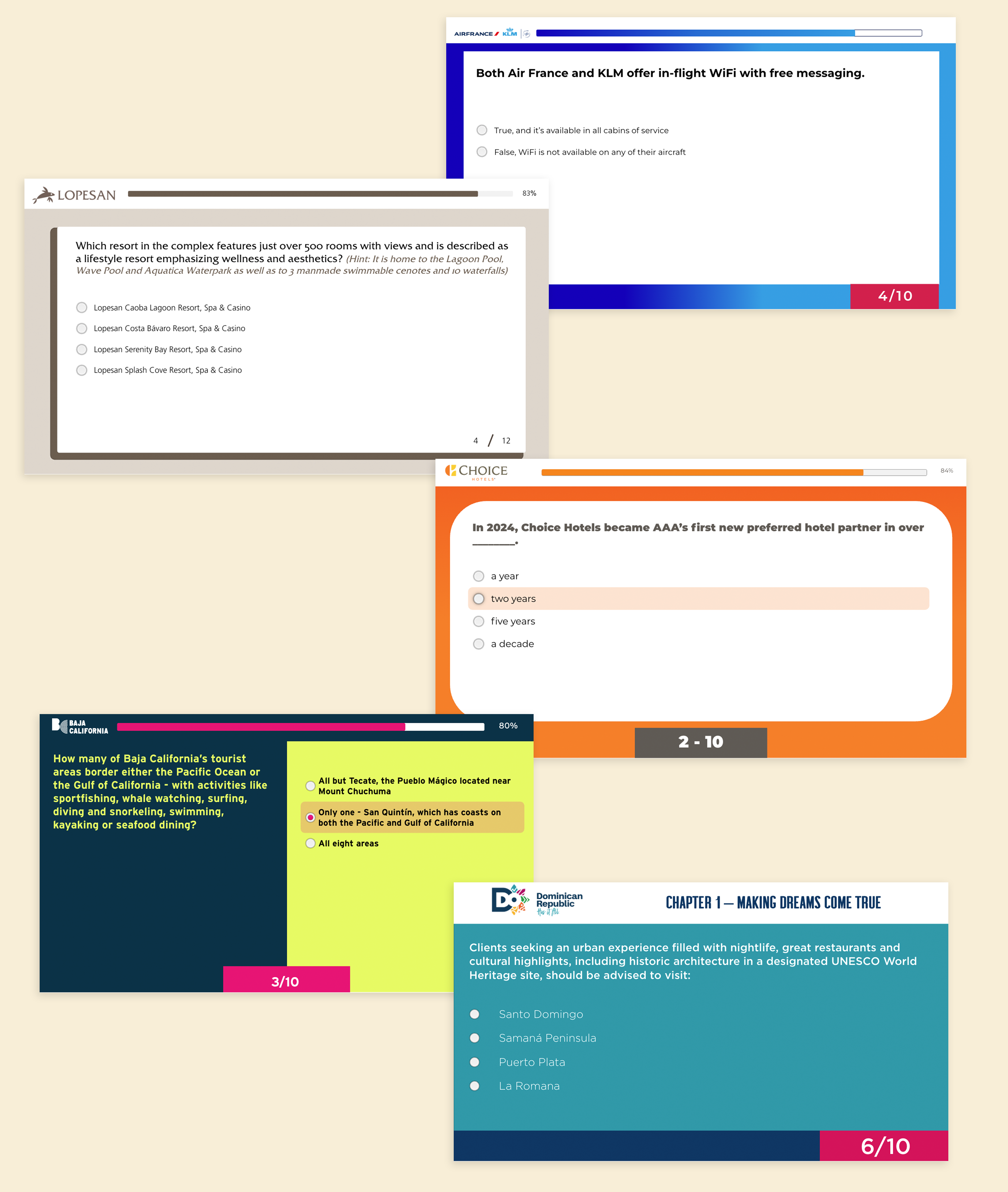
With the mockup approval along with the copy, it is time to insert the copy into the design. In order to accommodate copy, there are several slide layouts I designed throughout most courses. These layouts are designed to help enhance the copy while making the information easier to process for agents to digest. Slide layouts are used in the following on this page below.
———————————
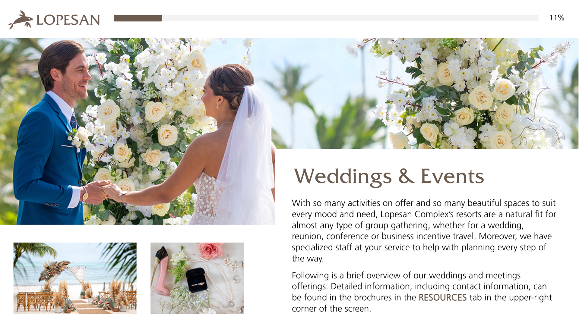
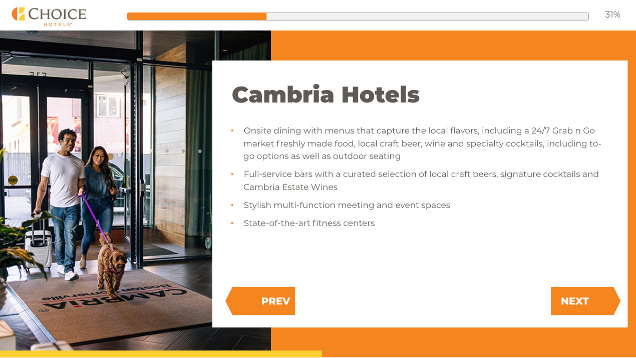
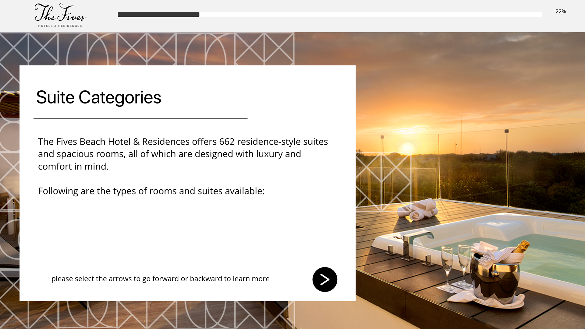
Single Slides and Slides with Pop Ups
Single Slides can be used as an introduction to the main chapter or sub-sections. Slides with pop-ups where there is a small amount of copy or to break a huge length of copy into three paragraphs. One main with one, two or three pop-ups.
———————————
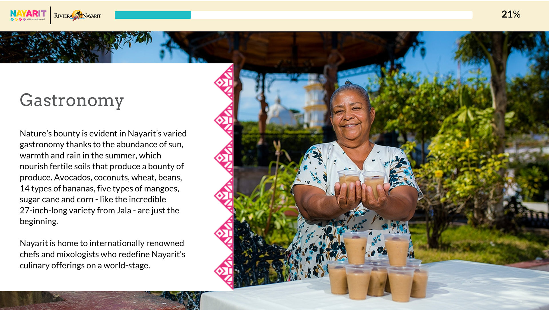
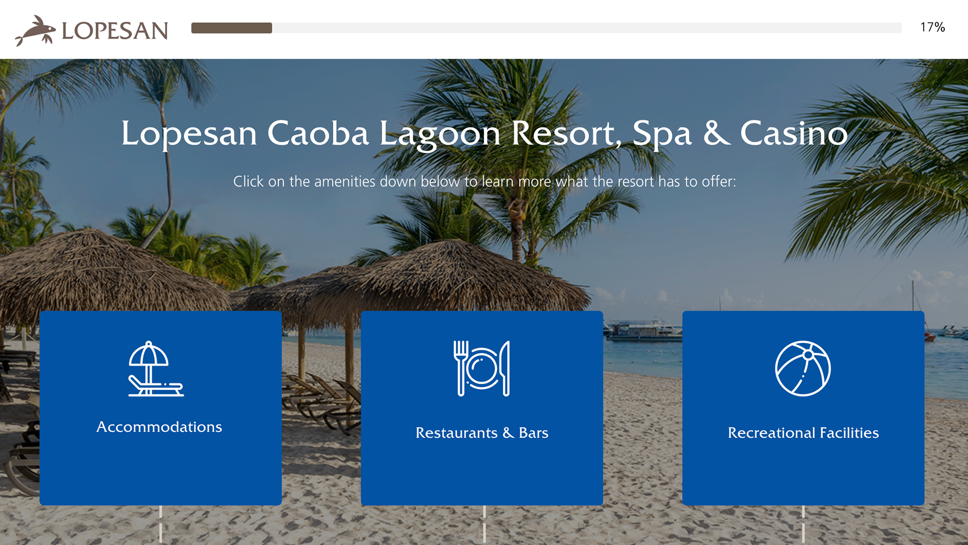
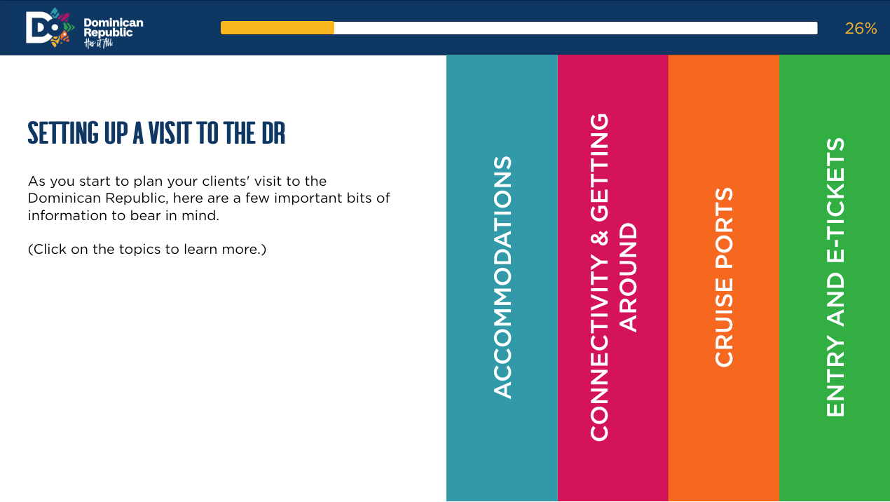
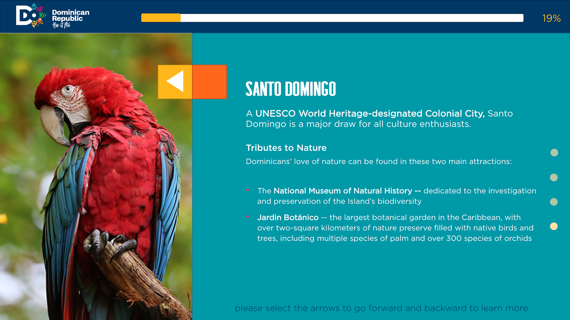
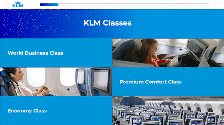
Submenu Slides
Submenu slides are created, and there are many subtopics related to one topic. Such designs can be divided into tabs featuring pictures, icons, and text to give the learner the gist of what they are learning, conveying information effectively, and enticing their curiosity.
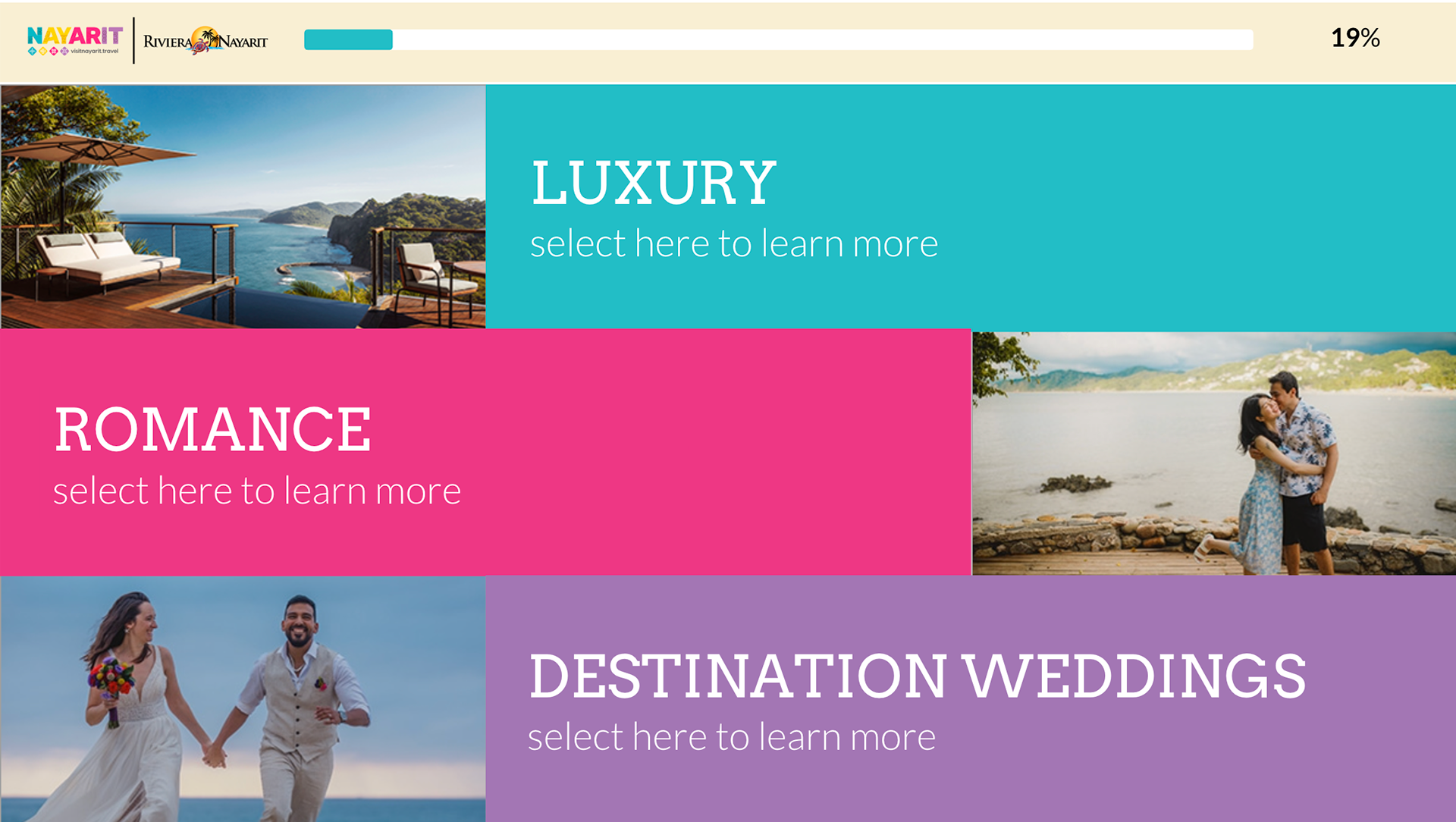
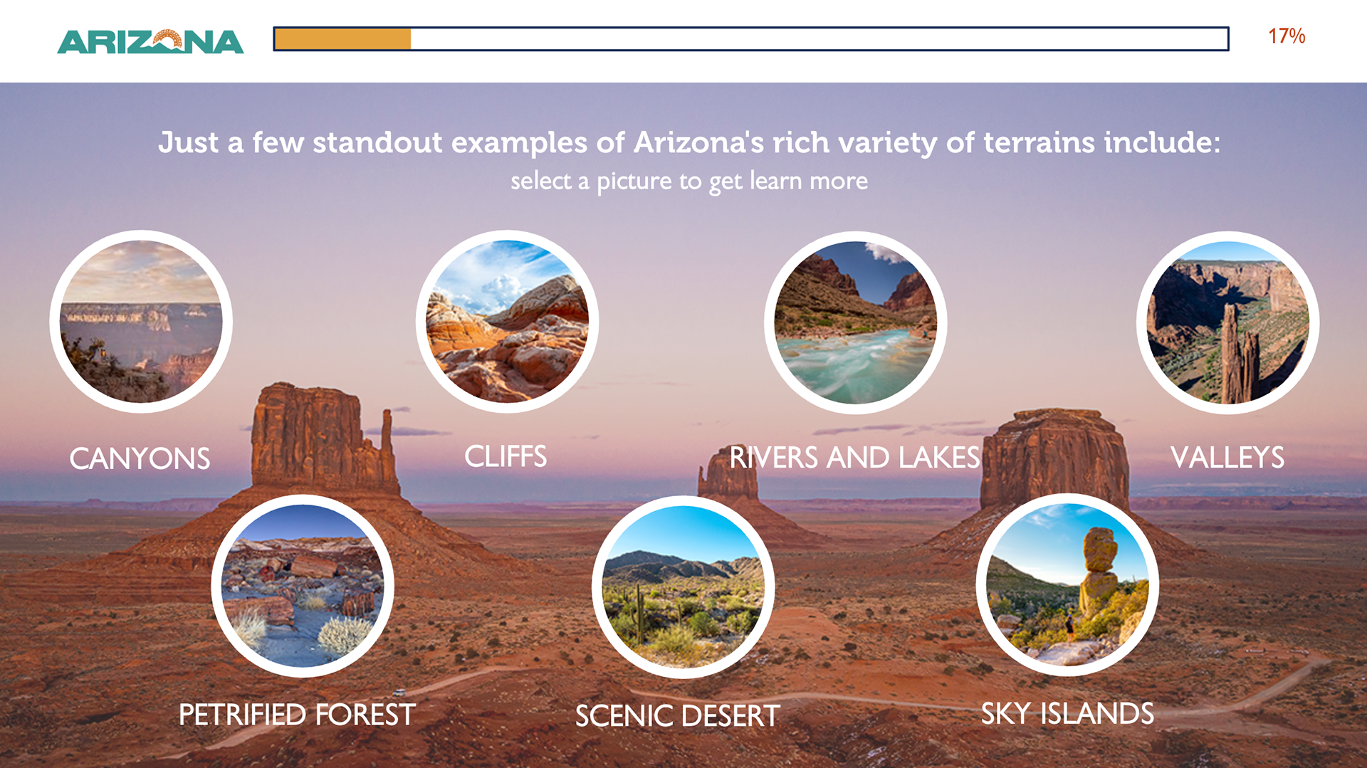
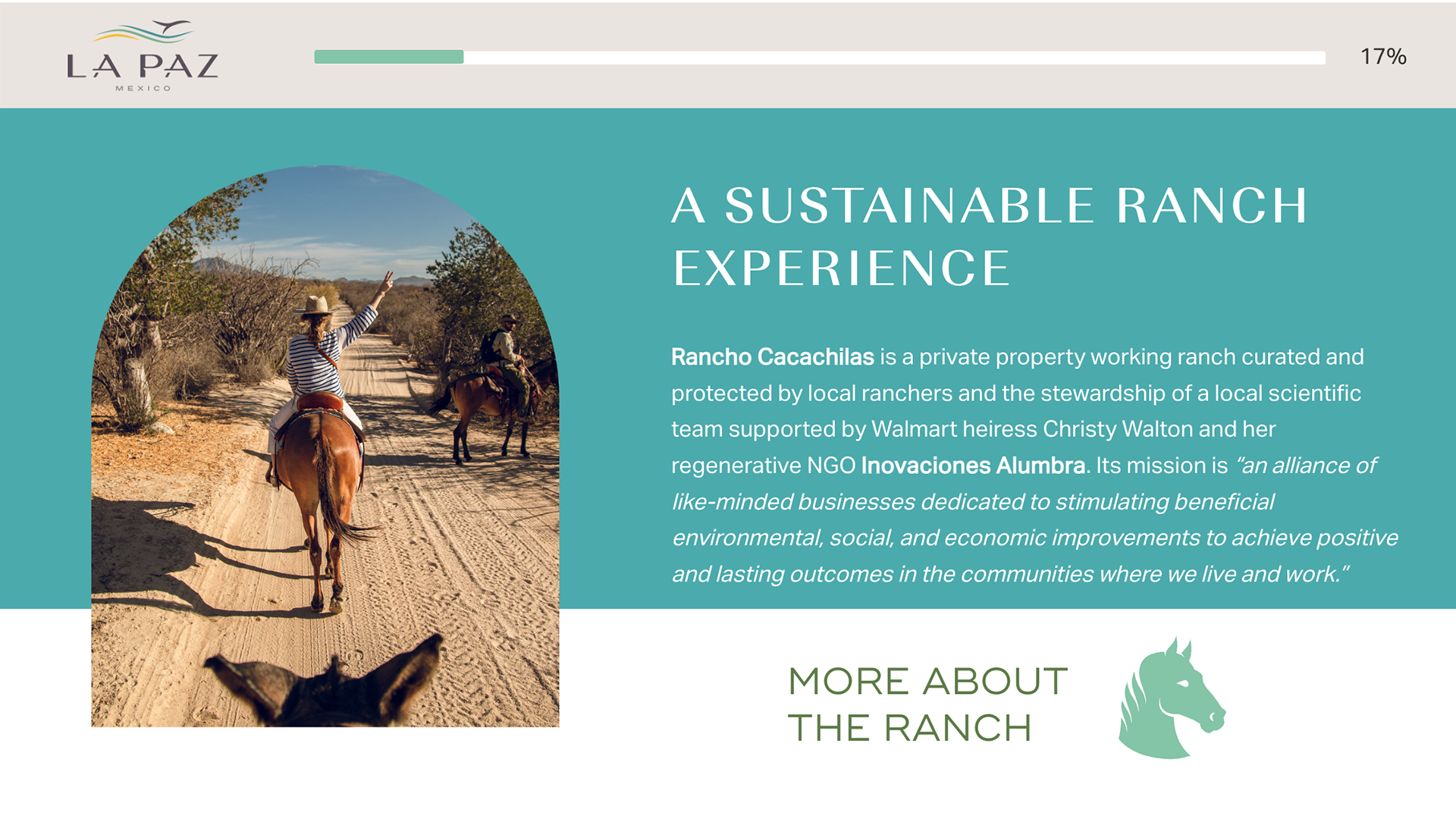
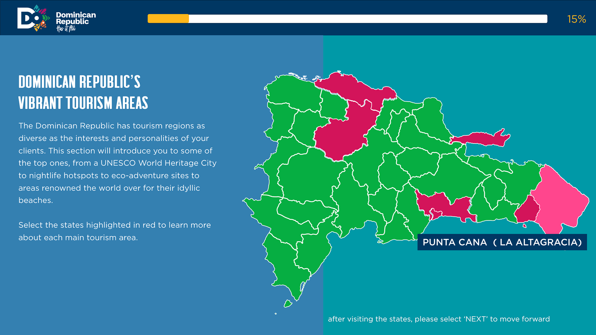
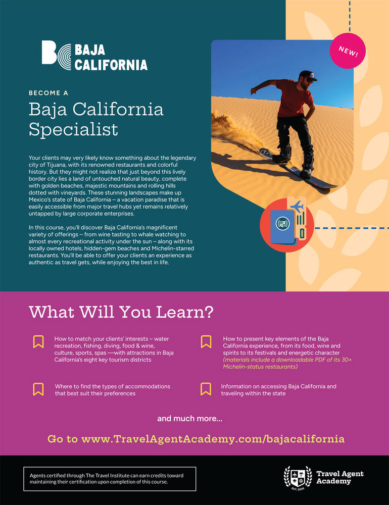
Submenus slide is created, and there are many subtopics related to a single topic. Such designs can be divided into tabs featuring pictures, icons, or text to give the gist of what they will learn within the course. Using effective graphics with a unique approach to entice a travel agent's curiosity will keep them engaged. For example, for each area of Baja California, the imagery and icons will do most of the talking, prompting the agent to seek out more information about each subtopic within that area.
Submenus slide is created, and there are many subtopics related to a single topic. Such designs can be divided into tabs featuring pictures, icons, or text to give the gist of what they will learn within the course. Using effective graphics with a unique approach to entice a travel agent's curiosity will keep them engaged. For example, for each area of Baja California, the imagery and icons will do most of the talking, prompting the agent to seek out more information about each subtopic within that area.
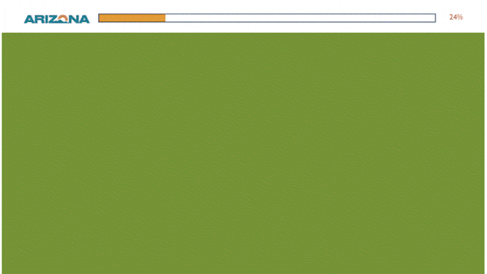
A mockup chapter for one of the destination courses, which was later approved, is moving to production, where the dummy copy will be replaced by actual copy written by the editorial. It showcases submenus where slide layers accommodate huge amounts of copy. This is for the Visit Arizona Specialist Program.
—————————————
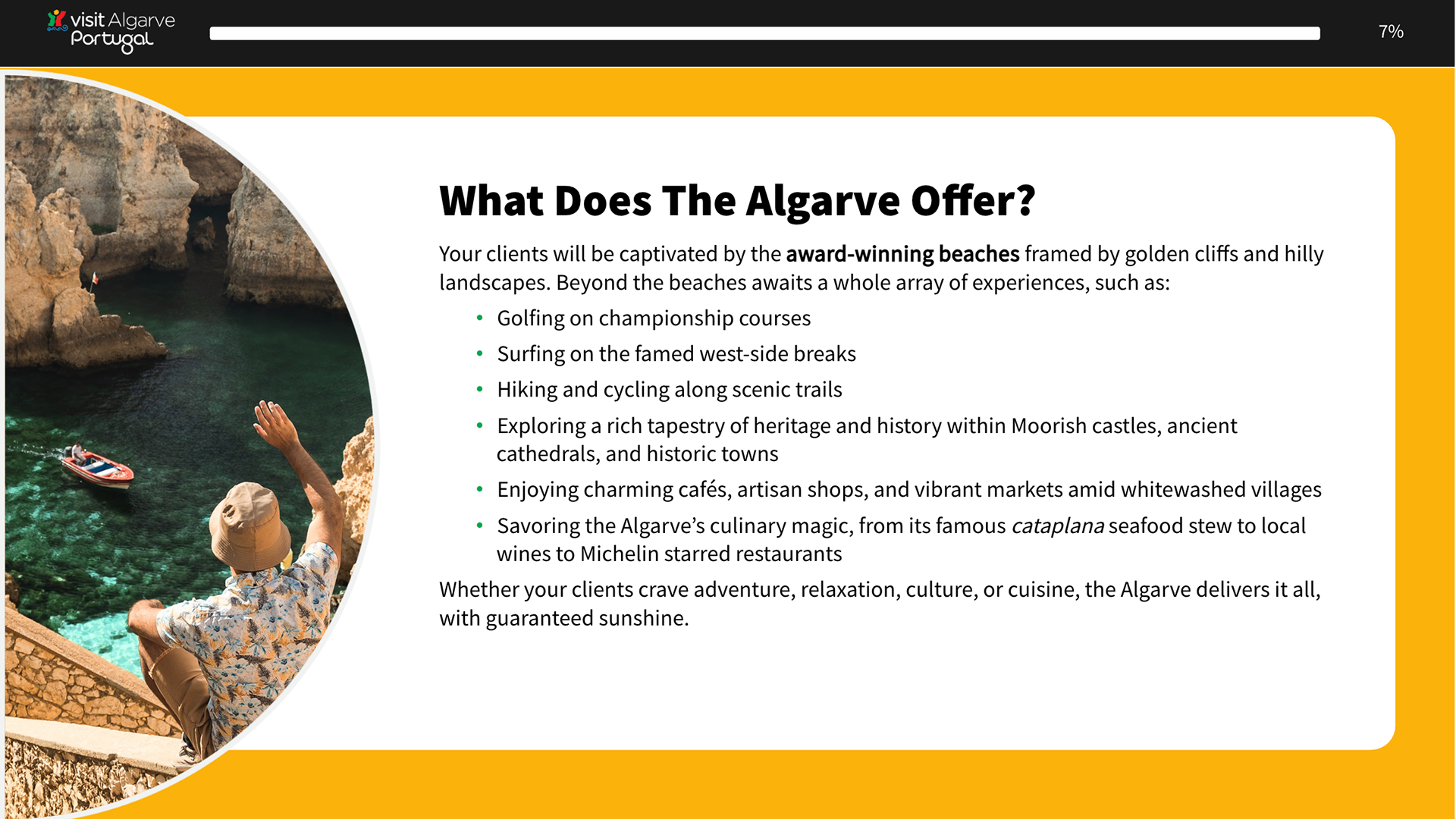
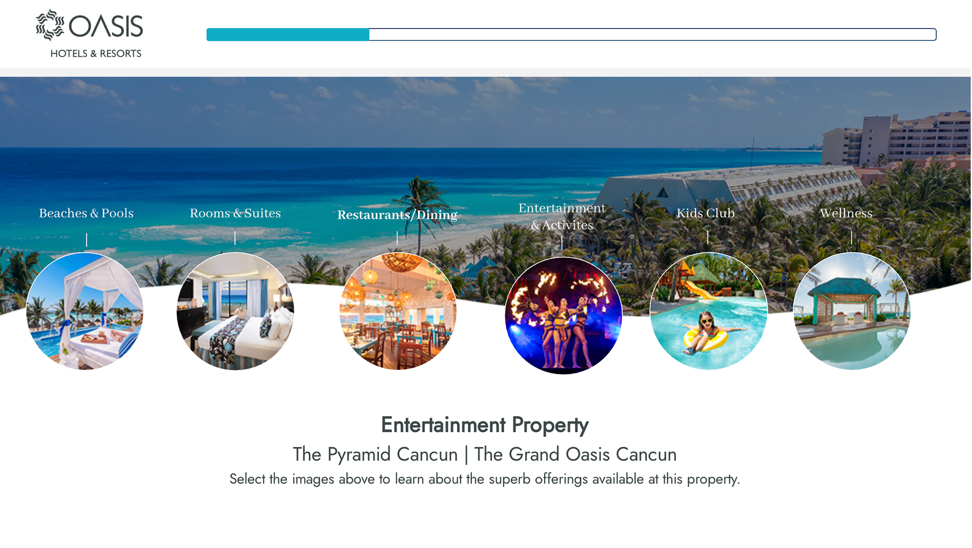
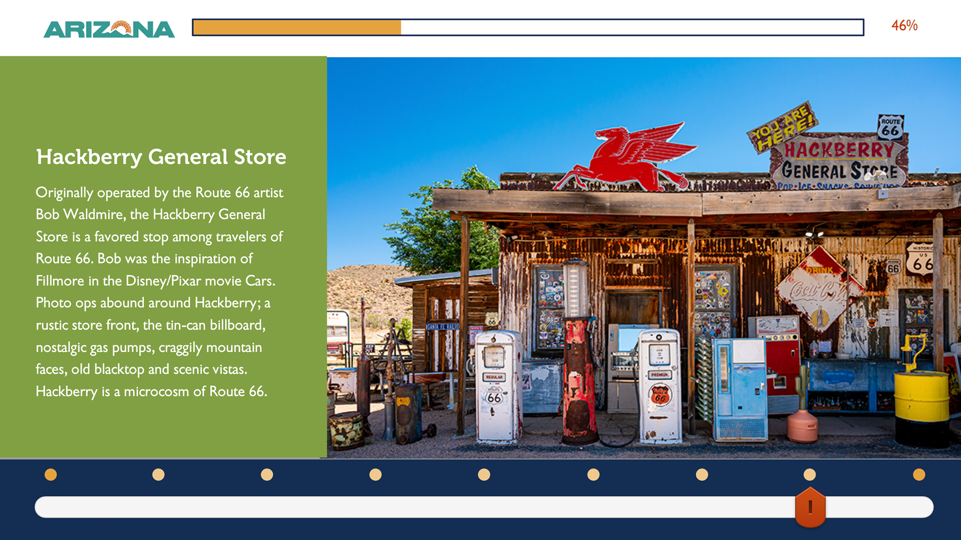
Slideshow Slides
Another design strategy where it keeps the learner engaging. This slide layout serves when there’s a lot of copy, where it divides into bullet points or small paragraphs to make it easier to digest. Each slideshow has a progress indicator that shows the learner where they are in the slideshow while adhering to the brand guidelines in creative ways.
———————————
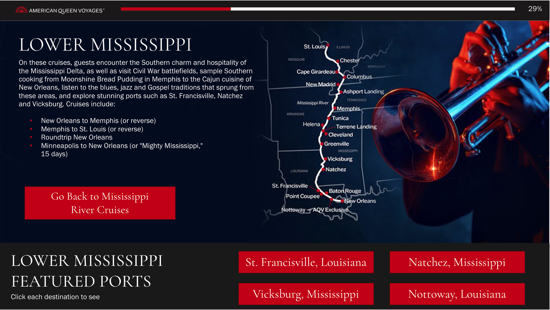
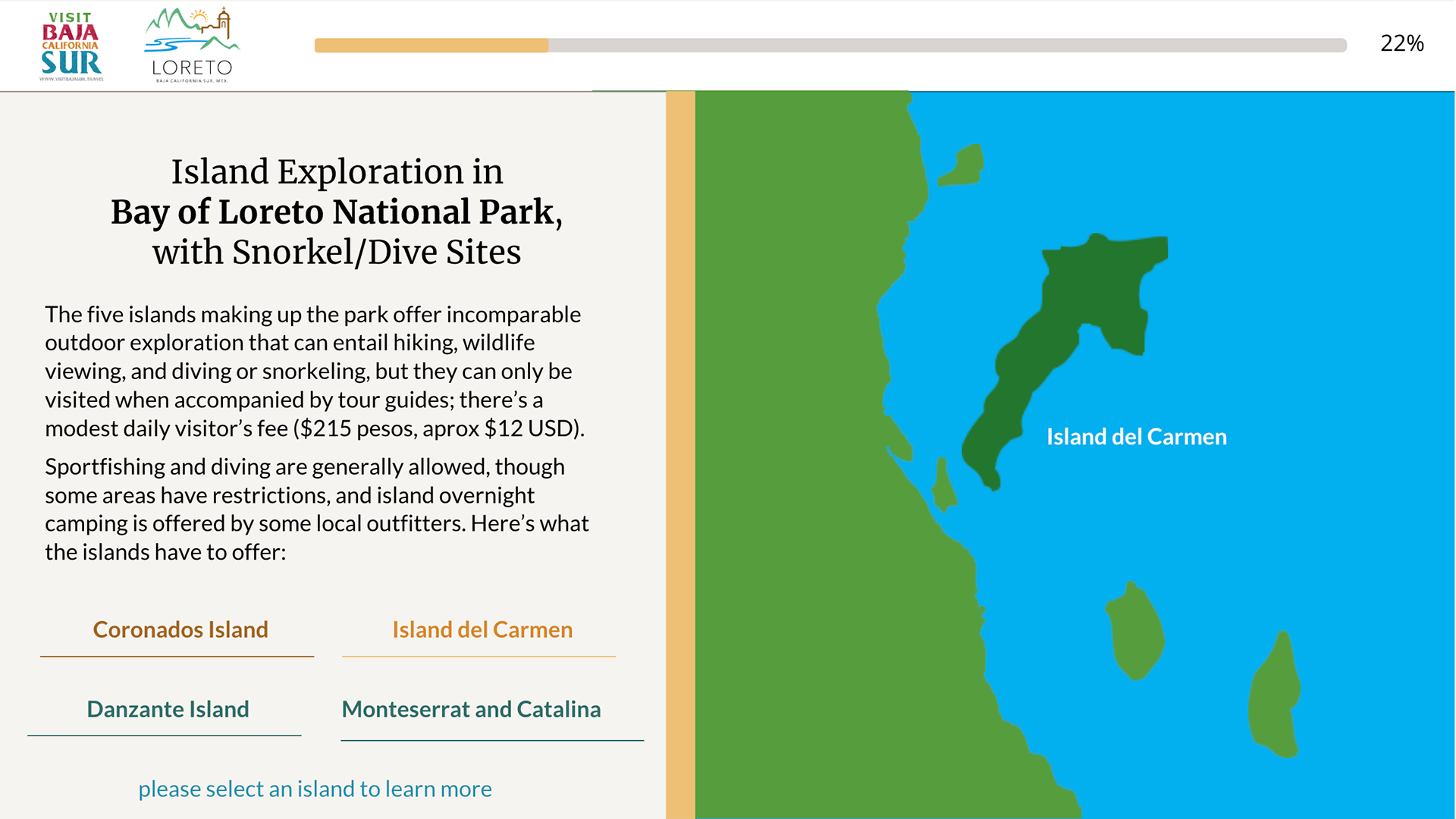
Map Slides
Slides with maps where it features areas and their offerings. Used in destinations, cruise, and airline courses to keep the agents engaging with the interactive content of the course.
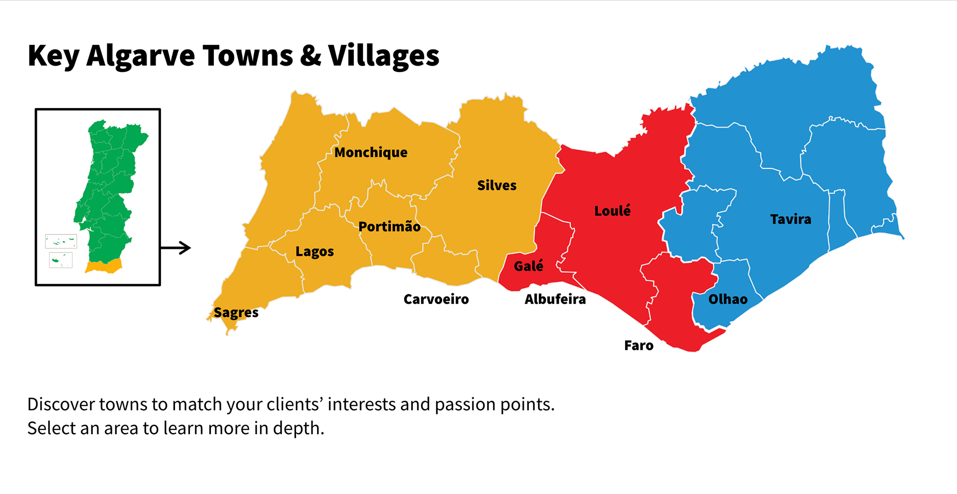
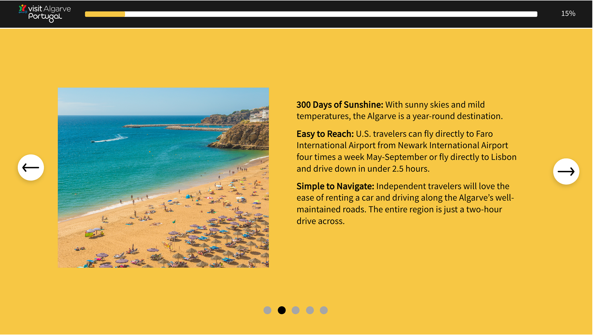
One of the most effective map slides is The Algarve Map, where the region, the Algarve, is divided into three areas using color-coding. Western Algarve for yellow, Eastern Algarve for blue, and Inland Algarve for red. These colors are also part of Visit Portugal’s branding colors, and it helps the agent to identify and remember which key town belongs to which side of the Algarve region. Watch the video below to see.
————————
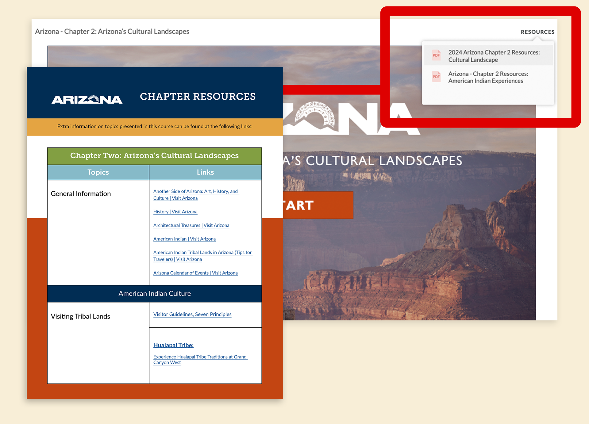
Resources PDF Design
Part of the e-learning programs has resources on hand to learn further about the incentives and guides for the courses. In the upper-right corner, there is a tab called Resources. This tab provides travel agents with additional information, incentives, and guides for their courses.
Most clients give the TAA team their own resources, such as brochures and guides. But there are times when a resource PDF must be designed to contain a large number of URL links to their sites. So I designed a template that contains this huge amount in an organized format that correlates with the topics within the course and its chapters.
Most clients give the TAA team their own resources, such as brochures and guides. But there are times when a resource PDF must be designed to contain a large number of URL links to their sites. So I designed a template that contains this huge amount in an organized format that correlates with the topics within the course and its chapters.
The documents are optimized for agents to download for a deep dive or a quick re-briefing on mobile. For every Resource PDF, the template is reusable as colors and typefaces are changed according to the branding guidelines of each client for their courses.
————————
Quizzes and Exams
The next step is to insert the quizzes and exams. This step is required as it helps agents to review what they have learned so far. The first one is the quizzes. Quizzes can be gamified, where they will have two tries to get it right. If not, they will be presented with the incorrect alert, followed by what are the correct answers.
For exams, they serve as an assessment that decides whether the travel agent will gain a certificate or not, depending on how well they aced the exam. For each exam, I have to design to fit the questions and answers well, depending on the length.
Marketing Materials for Travel Agent Academy
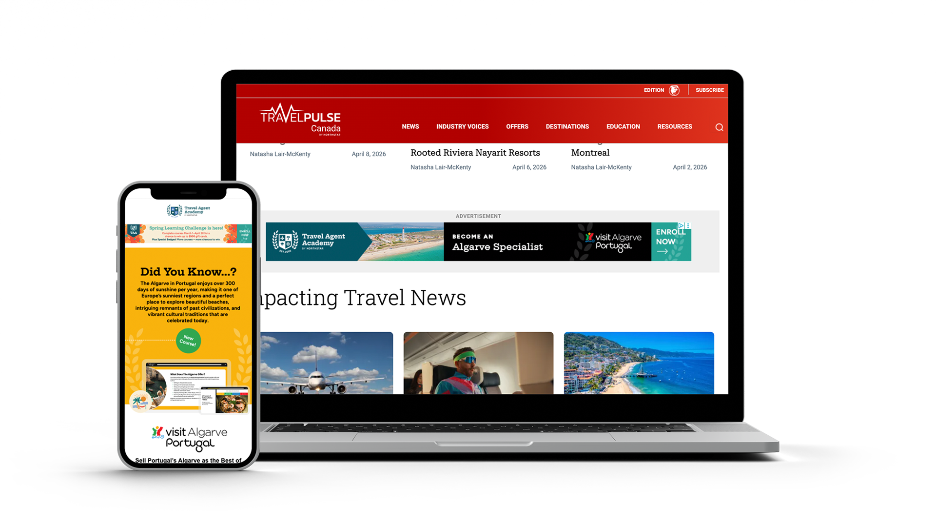
In addition to designing e-courses, I design marketing materials to promote them, such as web banners and full-page print ads. In 2024, TAA underwent a rebrand. I was tasked with redesigning banners and a full print ad to match the website's look. I collaborated with a designer who designed marketing emails to maintain brand consistency. Here are the web banners that were presented on TravelPulse and TravelPulse Canada by Northstar.
____________
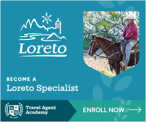
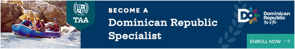
Web Banners for TAA
Following the TAA brand guidelines and using the colors of the client's brands to promote the courses. Here are some samples of each banner size.


728x90

2560x90

970x90

630x90
Marketing Email on the left
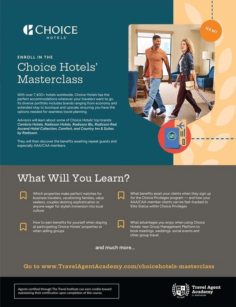
Full Page Print Ads
Social Media
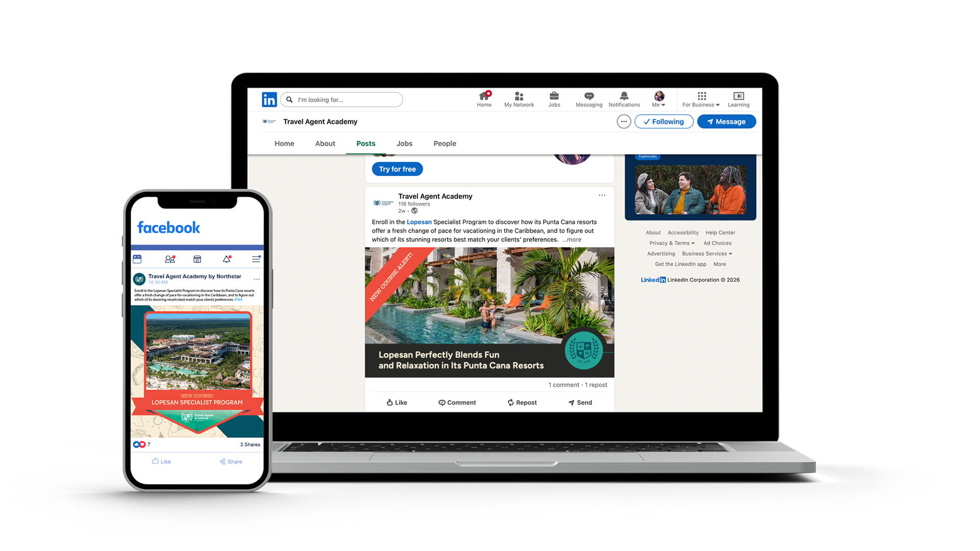
Not just on the travel websites but also on social media. I designed banners and graphic design posts for Travel Agent Academy to let agents use on social media. The ads will be displayed on Facebook and LinkedIn.
Facebook Post
LinkedIn Post
Promotions & Incentives
For further attraction, Travel Agent Academy gives incentives to agents who complete several courses, such as certifications, badges, and prizes.
For my role, I was tasked with designing badges for TAA courses. Following the branding guidelines of TAA, such as the colors and look, by using the graphic elements provided by them, such as the logo. I drew digital vector mini-illustrations for badges and made each badge distinctive from the others by creating elements that are known in the program(s). These badges are marketed as incentives and encourage agents to take more courses to obtain so they can collect them. Encouraging them that they are traveling and learning online, like how someone collects souvenirs at each destination.
For example, the roadrunner and the huge rock formations of the Grand Canyon are for the state of Arizona education course. Learn more about badge creation down below.
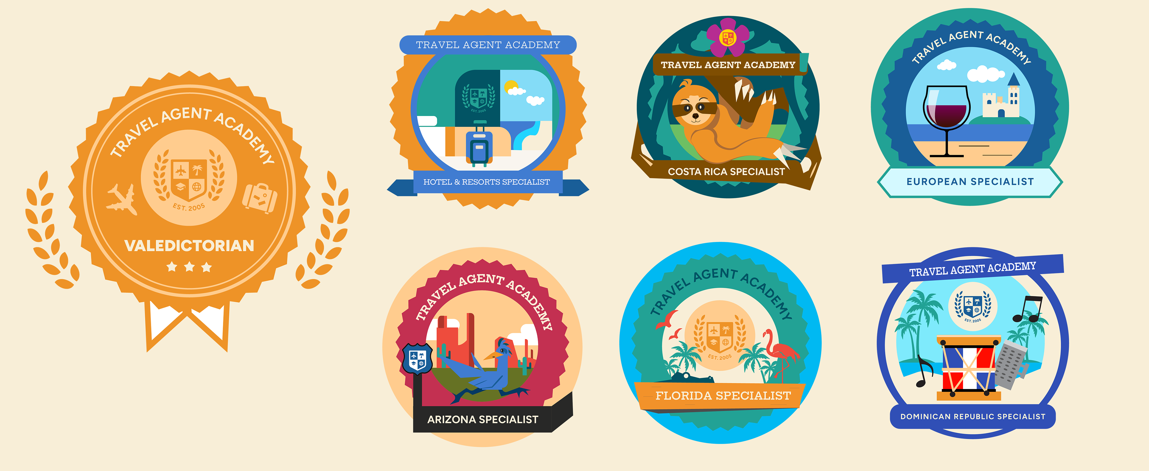
Badge Creation
There are three types of digital badges for TAA: the leveling-up badge, the category badge, and the destination badge.
The Leveling-Up Badges are for agents who complete a high number of courses. For TAA, we have Valedictorian, Salutatorian, and Dean’s List, which is considered the most valued badge.
Category Badges are for agents who complete courses that are related to the category. For example, if an agent completes the number of courses that are resort and hotel brands. They receive a hotel and resort badge.
Destination Badges are similar to Category badges, but there are badges exclusive only to courses that are single areas, such as Arizona and Costa Rica. The ones that have courses centered in Europe, such as Greece and the Algarve, Portugal, or places in Florida like Naples, Fort Myers, Miami, and the Everglades. The agents will receive the European Specialist Badge and the Florida Specialist Badge.
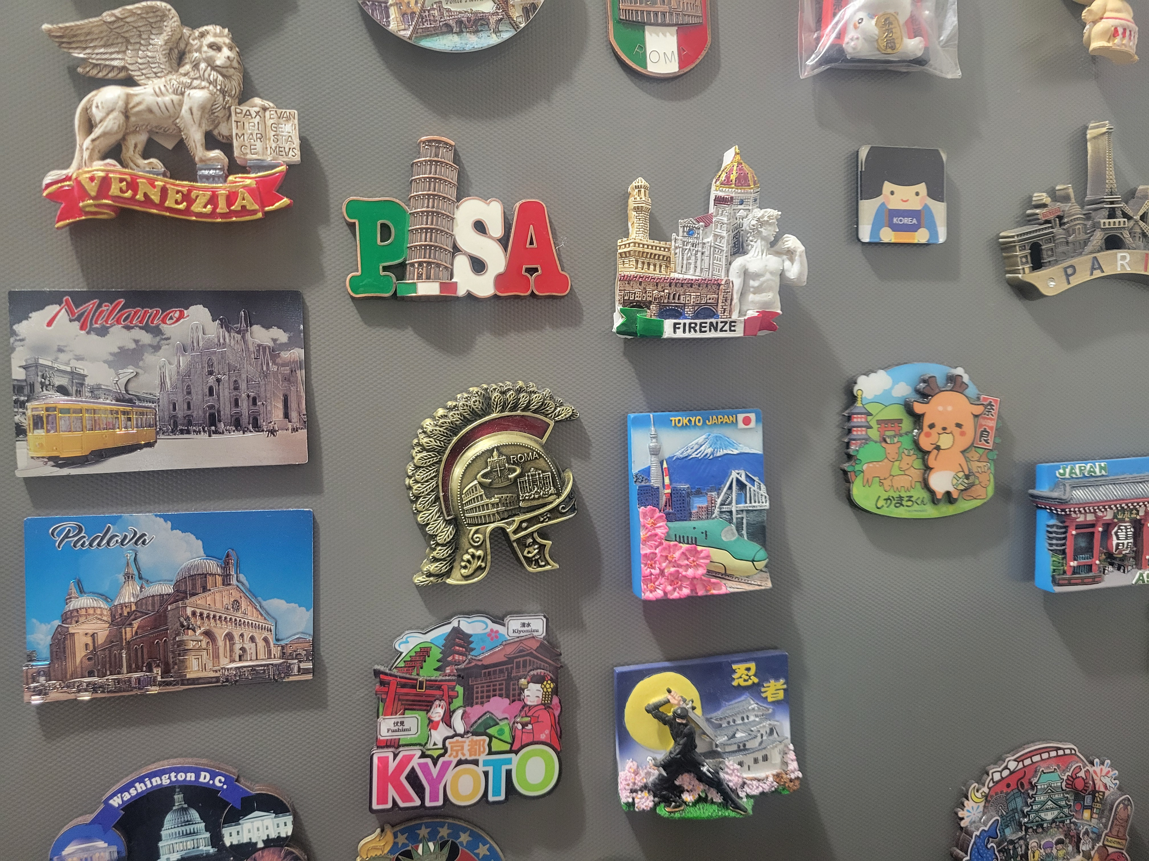
Inspiration Behind the Badges
My inspiration behind the creation of the digital badges is magnet souvenirs I bought from my travels. I want to give travel agents a sense of accomplishment that they have excelled in the course with the knowledge they have learned. Not just earning a certificate, but also a badge that emphasizes the best features of the course, which can help agents remember what they learn.
———————
Course Promotions
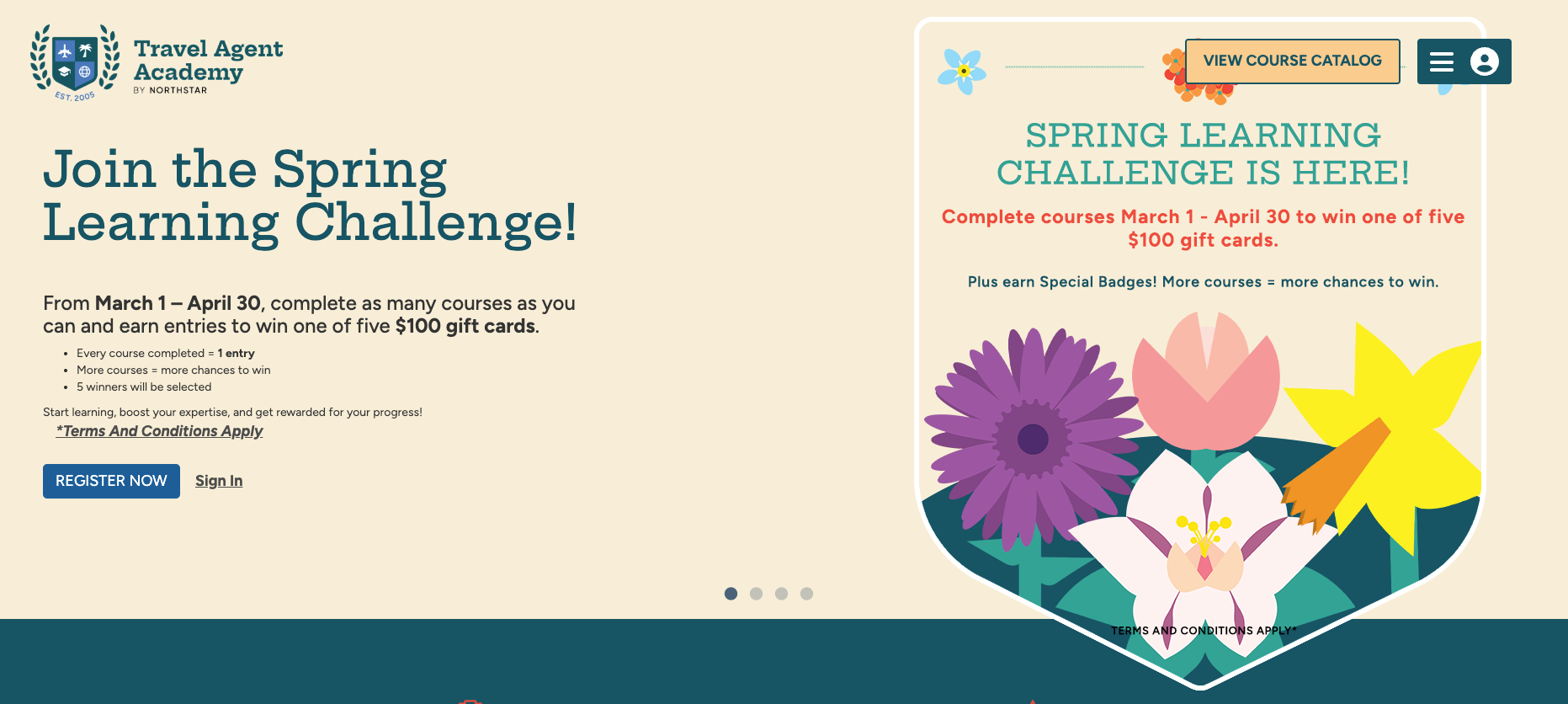

To increase enrollment numbers and completions. The TAA team decides to do incentives. Just now, we did our Spring Learning Challenge. For this, I create digital vector assets such as flora for the creative team to utilize in order to create banners and emails, and these flowers are used throughout the marketing.
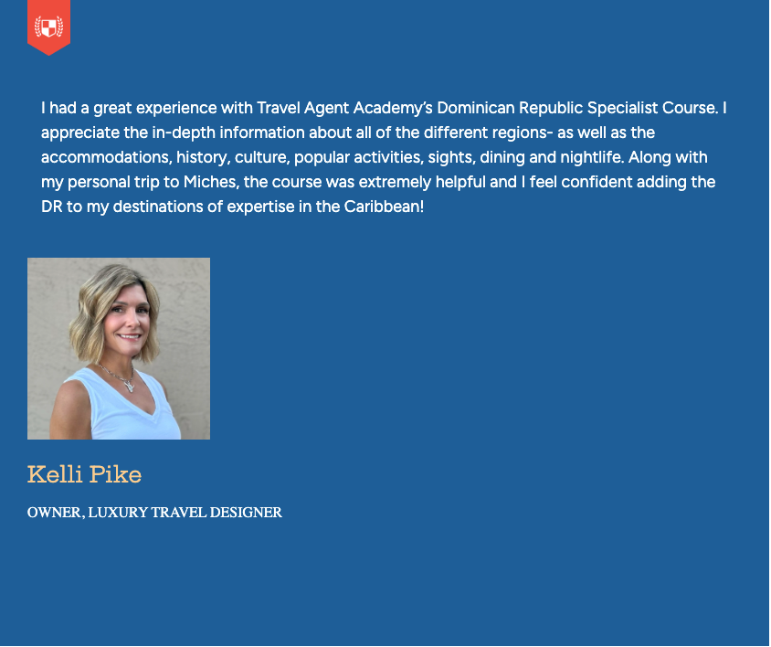
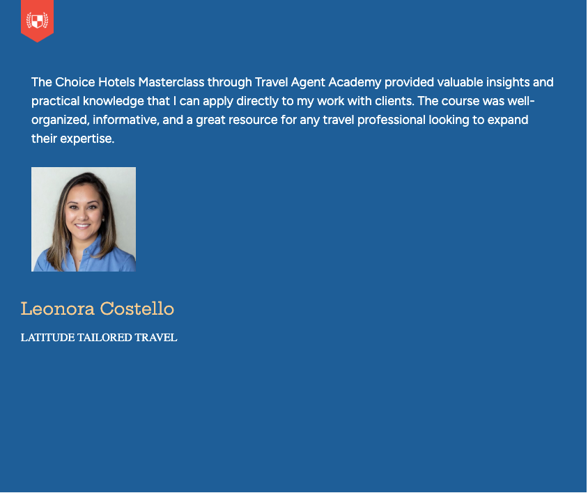
Testimonials from Travel Agents
End Note